Graphic User Interface Development Guide
Overview
The front end (GUI) of iMars3D is built on top of the holoviz stack, primarily utilizing the panel and param library. The overall design philosophy are:
derive the user interface from the backend functions with helper functions instead of building one from ground up
consistent choice of widgets for each type of parameter
Widget Design Principles
The widgets derived from backend functions should be constructed with provided (TBD) parsers.
Each widget should have a member function called panel to return the overall widgets.
When grouping several widgets together, please consider using panel.Accordion as the container.
Instead of directly executing the corresponding backend function, the widget should self-serialize its parameters into a dictionary.
The dictionary will be passed to an executor function to execute the backend functions in the order of their addition.
(Examples will be updated once the parser and executor function is finalized.)
import panel as pn
import param
import numpy as np
pn.extention()
# demo functions from backend
class func1(param.ParameterizedFunction):
arg1 = param.Integer(default=1, bounds=(0, 100), doc="arg1")
arg2 = param.Integer(default=2, bounds=(0, 100), doc="arg2")
def __call__(self, **params):
_ = self.instance(**params)
p = ParamOverrides(self, params)
return p.arg1 + p.arg2
class func2(param.ParameterizedFunction):
arg1 = param.Integer(default=1, bounds=(0, 100), doc="arg1")
arg2 = param.Integer(default=2, bounds=(0, 100), doc="arg2")
def __call__(self, **params):
_ = self.instance(**params)
p = ParamOverrides(self, params)
return p.arg1 * p.arg2
# demo widget
class DemoStage(param.Parameterized):
data = param.Array(doc="input data array")
width = param.Integer(default=100, bounds=(0, None), doc="width of the widget")
def widget_func1(self):
self.func1 = func1.instance()
app = pn.Param(
self.func1,
widgets={
"arg1": pn.widgets.IntInput,
"arg2": pn.widgets.IntInput,
},
width=self.width,
show_name=False, # disable derived name, use accordion label instead
)
return app
def widget_func2(self):
self.func2 = func2.instance()
app = pn.Param(
self.func2,
widgets={
"arg1": pn.widgets.IntInput,
"arg2": pn.widgets.IntInput,
},
width=self.width,
show_name=False, # disable derived name, use accordion label instead
)
return app
def panel(self):
return pn.Accordion(
("App1", self.widget_func1()),
("App2", self.widget_func2()),
)
# instantiate and display
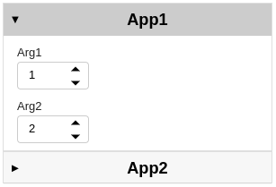
demo = DemoStage(data=np.random.rand(10, 10))
demo.panel().show()
The resulting demo will look like:
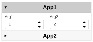
For most cases, the default row-stacking layout should be sufficient. If needed, one can build the widget one component at a time before manually specify the layout. For example, the member function can also be implemented as below
def widget_func1(self):
    self.func1 = func1.instance()
    arg1 = pn.widgets.IntInput.from_param(self.func1.param.arg1)
    arg2 = pn.widgets.IntInput.from_param(self.func1.param.arg2)
    return pn.Row(arg1, arg2, width=self.width)

def widget_func2(self):
    self.func2 = func2.instance()
    arg1 = pn.widgets.IntInput.from_param(self.func2.param.arg1)
    arg2 = pn.widgets.IntInput.from_param(self.func2.param.arg2)
    return  pn.Row(arg1, arg2, width=self.width)
Now the resulting demo will look like:
Widget Selection
The UI library panel provides multiple widgets for each input type, and it is very tempting to try out all of them in your app. However, it is recommended to use the following recommended widgets for each input type so as to maintain an consistent style throughout the entire frontend.
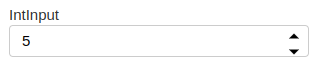
Integers: use
panel.widgets.IntInput
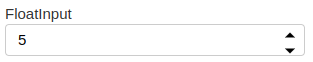
Floats: use
panel.widgets.FloatInput
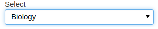
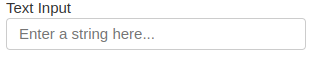
- Strings:
use
panel.widgets.Selectwhen requiring users to select an option from a limited list.use
panel.widgets.TextInputwhen asking users to provide an arbitrary string.
Booleans: use
panel.widgets.Checkbox

If you are running into situations where the widgets above are not sufficient, please either raise the question during the status meeting (non-urgent case) or contact a senior developer to check if customized widgets are needed (urgent case).
Useful resources for GUI development
panel’s reference gallery (https://panel.holoviz.org/reference/index.html)param’s official documentation page (https://param.holoviz.org/user_guide/index.html)holoviz’s official discussion forum (https://discourse.holoviz.org/)